

Project Overview
ED Pharma needed a clean healthcare website that could present company information in a simple and professional way.
The website had to feel trustworthy, easy to browse and suitable for users looking for healthcare-related business information.
We focused on readable sections, professional styling and mobile-friendly layouts to create a clear digital presence.
The Results
+52%
Page Clarity
+46%
User Flow
+100%
Mobile Friendly
-30%
Content Drop-Off
The new layout made the website easier to scan and helped visitors understand the company faster across desktop and mobile.
By improving spacing, hierarchy and navigation, the website achieved a more professional healthcare-focused presentation.
The Execution
We used a structured execution approach focused on strategy, clarity and performance so the project could deliver a polished experience instead of only a visual redesign.
Clean Content Flow
We arranged content into simple sections so visitors could browse company information without confusion.
Healthcare Styling
The visual direction was kept minimal, professional and trustworthy to match the healthcare industry tone.
Responsive Build
Every section was adjusted for mobile and desktop so the website could maintain readability across screen sizes.
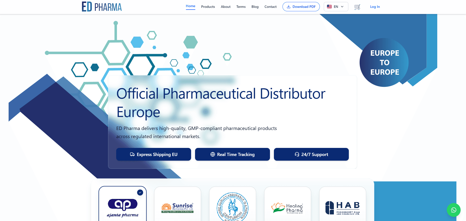
What We Delivered
Healthcare website design
Clean content sections
Responsive development
Brand-focused layout
User-friendly navigation
Professional service presentation
Mobile-friendly page structure
Readable content hierarchy
Challenge
ED Pharma needed a clean healthcare website that could present the company professionally and make important information easy to access.
Solution
We created a simple, professional and responsive layout with clean sections, readable content and easy navigation.
Outcome
The final website improves brand presentation and gives users a smoother browsing experience across devices.
Project Details
Clean Content Flow
We arranged the content into easy sections so visitors can understand the company without confusion.
Professional Styling
The design keeps a healthcare-friendly tone with soft spacing, simple visuals and readable typography.
Responsive Build
The website works smoothly across mobile and desktop screens.
Brand Communication
The page structure supports clear company messaging and helps users understand services quickly.
Readable Layout
Typography, spacing and content blocks were kept simple so visitors can scan information easily.
FAQs
Was the design healthcare-focused?
Yes, the design was created with a clean and professional healthcare website style.
Is the website mobile responsive?
Yes, the layout is responsive for different screen sizes.
Was the content easy to browse?
Yes, the website uses simple sections and clear navigation for a smooth browsing experience.